
5 Tips to Create DTF Designs That Sell Like Crazy

DTF printing is a cost-effective solution for garment decorators, offering stunning results on a budget, and has become a popular choice in the industry. While the process is beginner-friendly, achieving perfect designs for optimal prints still requires some skill. In this post, we’ll share five expert tips to help both beginners and professionals create DTF designs that deliver professional-quality results
Table of Contents
- Tip 1: Enhance Hand Feel for a Lasting Impression
- Removing The Background
- Using Halftones
- Tip 2: Optimize Size and Placement for Visual Impact
- Tip 3: Boost Vibrancy for Eye-Catching Designs
- RGB vs. CMYK: Choosing The Right Color Modes
- Adjust Color Settings (Brightness, Contrast, Levels, Curves,etc.)
- Tip 4: Preserve Details and Fine Lines
- Choose The Right File Types: Vector vs. Raster
- Recommended Design Resolution for DTF Transfers
- Perform Quality Check Before Printing
- Tip 5: Follow Universal Design Principles
- Additional Resources for Free DTF Designs
- Conclusion
Tip 1: Enhance Hand Feel for a Lasting Impression
While DTF printing offers numerous benefits, including a naturally softer feel compared to other methods, achieving breathable and soft-hand prints can be challenging with large, solid designs that lack spaces or “cavities.” To maintain a soft and flexible feel, it’s important to consider this when creating your designs. In our previous post, we shared 10 tips for achieving softer DTF prints, with the two most popular methods being removing the background and using halftones.
Removing The Background
Removing the background, or “knocking out” the shirt color, is one of the most effective techniques for preparing DTF designs. Removing the background of DTF designs not only enhances visual appeal but also results in lighter, more flexible prints by reducing ink and adhesive, improves breathability by allowing fabric to “show through,” creates a more professional look by blending seamlessly with garment colors, and prevents the stiff, uncomfortable “box” effect.
Here are some extra tips to consider in this concern when designing:
- Start with a transparent background in your design software for easy integration with the garment.
- Use the garment color strategically within your design to enhance the overall look.
- Incorporate negative space to allow the shirt color to show through and create a more breathable print.
- For photos or complex images, use soft edges or fades instead of hard cutoffs for a smoother, more natural transition.
Using Halftones
Halftone printing creates an illusion; the size, shape, and spacing of the tiny dots are blended into a continuous tone by the human eye. The result is an image with a softer, more complete visual appearance.
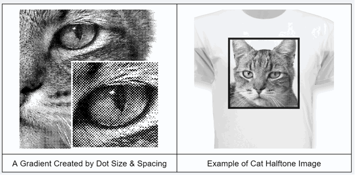
In DTF printing, halftones are a game-changer for several reasons:
- Softer feel: Halftones break up solid ink areas, resulting in lighter, more flexible, and breathable prints.
- Natural blending: They enable designs to fade seamlessly into the garment color, creating a more cohesive appearance.
- Enhanced detail: Halftones add depth and texture to your designs, particularly in gradients and photographic elements.
- Professional finish: When executed well, halftones elevate print quality, making designs look polished and retail-ready.
Tip 2: Optimize Size and Placement for Visual Impact
The use of transfer film in DTF printing allows for versatile decoration options on garments. It’s essential to choose the right size and placement to create impressive designs that enhance the garment’s wearability. Check out our comprehensive guide on DTF design sizing and placement.
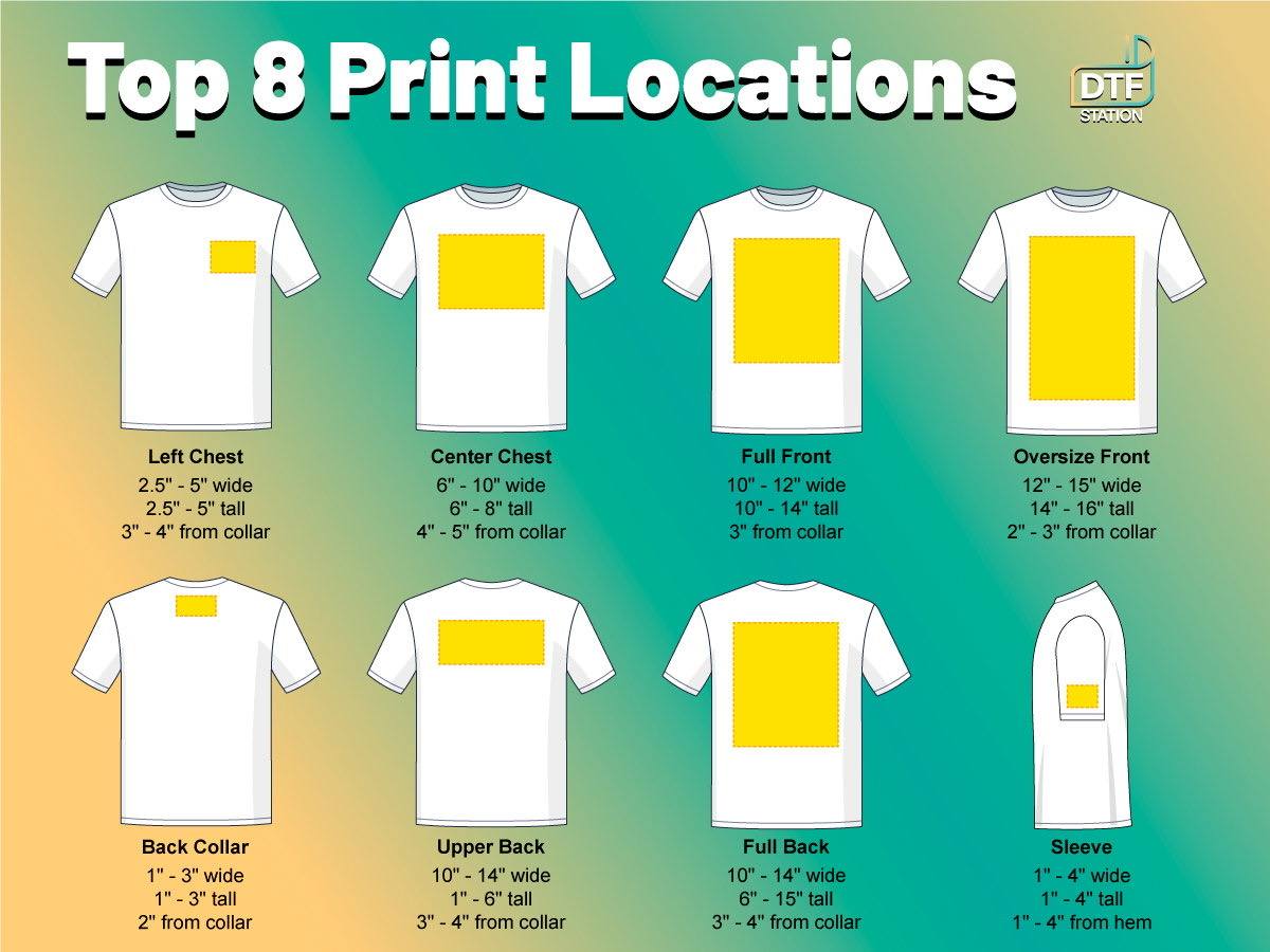 DTF Designs Sizing & Placement Guide
 Here are some key considerations in this concern:
- Moderation matters: Avoid oversized designs that overshadow the garment; a modest size is typically more professional.
- Adapt to garment sizes: Scale your design for different sizes, from youth to adult 3XL.
- Consider print placement: Be mindful of standard print areas (chest, full front, back) and how size affects positioning.
- Enhance breathability: Smaller prints improve airflow for added comfort.
- Maintain flexibility: Modest-sized prints preserve the garment’s natural drape.
- Aim for visual balance: Choose designs that complement the garment without overwhelming it.
- Check graphic quality: Ensure clarity when enlarging raster graphics to avoid soft edges.
Tip 3: Boost Vibrancy for Eye-Catching Designs
Many garment decorators prefer DTF printing for its vibrant prints; however, without well-prepared design files, you may not achieve the desired vibrancy. Here are some essential design tips to ensure your colors meet your business requirements:
RGB vs. CMYK: Choosing The Right Color Modes
RGB is an additive color model used for digital screens, combining red, green, and blue light to create vibrant hues. In contrast, CMYK is a subtractive color model used for printing, where colors are formed by subtracting light, often resulting in duller shades. Since many designers prefer RGB for design purposes while printers use CMYK, choosing the correct color mode is crucial for achieving the desired vibrancy. One common mistake to avoid is converting an RGB file to CMYK in graphic software, as this can lead to less vibrant prints.
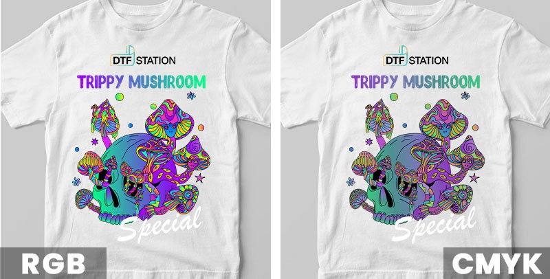
Here are some additional tips to ensure you have the right file with the appropriate color mode:
- Work in RGB Mode: Start your design process in RGB mode to take full advantage of the wider color gamut, allowing for more vibrant and diverse color options.
- Preview in CMYK Mode: Always preview your design in CMYK mode to understand how the colors will shift when printed, ensuring you’re prepared for the final output.
- Save Files in sRGB Format: Save your DTF files in sRGB (standard) format and let professional-grade RIP software handle the conversion to CMYK for optimal color reproduction and vibrancy.
- Vector and Raster Designs: If your design is in vector format and started in CMYK, submit it as is to maintain color integrity. For raster designs in CMYK, convert to sRGB before adjusting levels for the best results.
Adjust Color Settings (Brightness, Contrast, Levels, Curves,etc.)
Enhancing color vibrancy effectively involves tweaking your color settings. Here are some important adjustments to consider for achieving the best results in your designs:
- Brightness: This setting adjusts the overall lightness or darkness of your image. Increasing brightness can make colors more pronounced, but excessive adjustment may wash out fine details.
- Contrast: This modifies the difference between the lightest and darkest areas, adding depth and making colors appear more vivid. However, too much contrast can disrupt the overall color balance.
- Levels: This tool allows for fine-tuning of shadows, mid-tones, and highlights, which enhances the tonal range and improves overall vibrancy.
- Curves: Offering greater control over tonal adjustments, this setting allows for subtle changes in brightness and contrast without affecting the entire image uniformly.
- Vibrance: This adjustment subtly boosts the intensity of less-saturated colors more than those that are already vivid, enriching the overall palette without overwhelming the image. You can often increase vibrance by 50% or more without significant disruption.
- Saturation: This increases color intensity, making them more vivid. However, excessive saturation can lead to unrealistic colors. Generally, a 10-20% increase is advisable to avoid blowing out the colors. It’s best to start with vibrance adjustments for added richness while using saturation sparingly to prevent oversaturation.
- Rich Blacks: Saturated blacks are crucial for enhancing a print’s vibrancy. A “rich black” is achieved by mixing different amounts of CMYK ink, resulting in a deeper black than using black ink alone. For vector files, use CMYK sliders to blend in other colors for a fuller effect, but avoid maxing out all four inks to prevent bleeding. For sRGB raster images, adjust levels for fully saturated blacks while maintaining vibrant midtones. Additionally, use “Selective Color” to introduce other colors into the black.
Tip 4: Preserve Details and Fine Lines
One major advantage of DTF printing that other methods struggle to match is its ability to capture intricate details and fine lines. DTF prints offer sharp lines, intricate patterns, and delicate shading, making them perfect for detailed text, logos, and complex designs. To fully maximize this capability, there are a few key factors to consider in your design process.
Choose The Right File Types: Vector vs. Raster
The file type you select for DTF printing greatly impacts the quality and vibrancy of the final product. There are two main categories: vector and raster files. Vector files (AI, EPS, PDF) utilize mathematical points, allowing for infinite scaling without losing quality, making them ideal for designs with solid colors and sharp lines. In contrast, raster files (JPEG, PNG, TIFF) consist of pixels and are better suited for detailed images and photographs, but their quality relies on resolution, which can diminish when scaled.
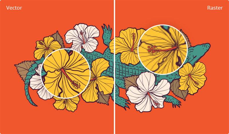
To achieve optimal results, use vector files whenever possible, especially for solid colors and text. If you choose raster files, select high-resolution formats like PNG or TIFF to maintain detail and vibrancy. Avoid GIFs, as they are limited to 256 colors and do not provide the quality needed for high-quality DTF prints.
Recommended Design Resolution for DTF Transfers
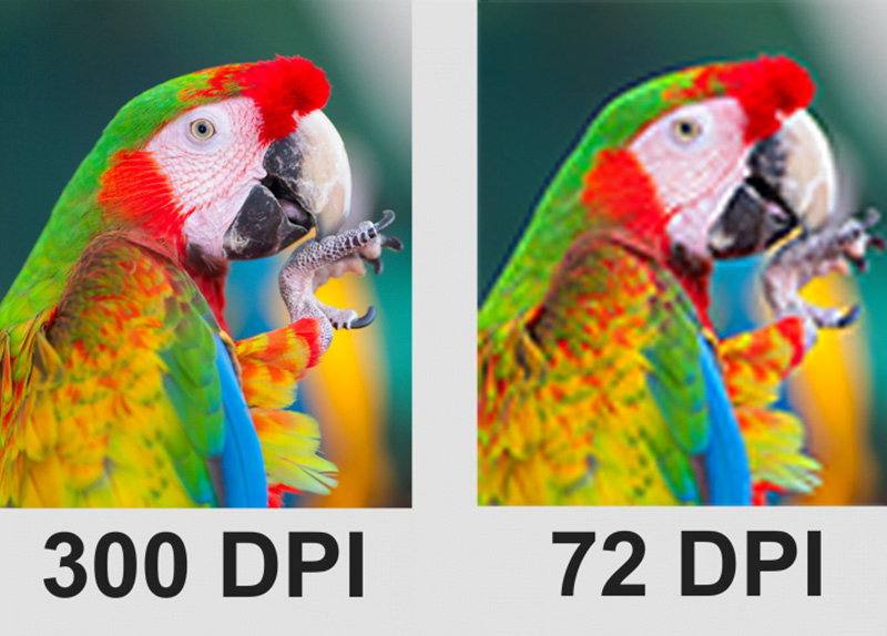
Achieving sharp, vibrant DTF prints depends on selecting the correct image resolution. Measured in DPI (dots per inch), higher resolutions deliver greater detail, while lower resolutions may lead to blurred or pixelated results. For DTF transfers, the industry standard for high-quality output is 300 DPI, ensuring precise details and vibrant color reproduction.
Perform Quality Check Before Printing
After following all the tips mentioned, you may have stunning designs ready for printing, but it’s always wise to conduct a final quality check before proceeding. When performing a final quality check for your DTF designs, it’s essential to ensure that all fine details will transfer properly.
Although DTF printing handles intricate elements well, avoid including design features smaller than 0.02 inches (0.5mm), as they may not print accurately. A helpful tip is to use a 0.02-inch circle as a reference when reviewing your artwork—if any part of the design fully overlaps with this circle, it may not print successfully. This quick check can help you maintain the crispness and clarity of your final print.
Tip 5: Follow Universal Design Principles
The four tips above focus on enhancing your design effects, but before applying them, it’s even more important to create a design where all elements blend seamlessly for an eye-catching result on your garment. If you’re using original, unique designs for your business, it’s crucial to follow universal design principles to ensure your artwork is cohesive and professional. Keep the following guidelines in mind to make your DTF designs visually harmonious and impactful:
- Simplify The Design: The first principle is to simplify the design, as simplicity enhances clarity and impact in printed formats. Focus on key elements by identifying and emphasizing the most critical parts of your design, such as the central image, logo, or text. Reduce clutter by removing unnecessary details that do not contribute to the overall message or aesthetic, making the design more legible and impactful.
- Bold Outlines: Incorporating bold outlines into your design enhances contrast and helps elements stand out. Thick outlines create a striking boundary that makes components pop, especially against busy backgrounds. A white outline can further improve visibility on darker surfaces, offering strong contrast for a more dynamic look. This technique also imparts a ‘big sticker’ effect, ideal for achieving a bold visual impact.
- Composition: Learn how to effectively arrange elements to create visual balance and guide the viewer’s eye through your design.
- Typography: Understand font selection, pairing, and layout to ensure that your text remains readable and visually appealing.
- Color Theory: Master the use of color wheels, complementary colors, and color psychology to develop impactful designs.
- Branding: Grasp the essentials of establishing consistent and recognizable brand identities across various products.
- Visual Hierarchy: Emphasize key elements and organize information to enhance communication within your design.
- Negative Space: Understand how to use empty space effectively to highlight key elements, achieve cleaner, more professional-looking designs.
Additional Resources for Free DTF Designs
If you have your own design team for your garment decoration business, above tips can help you achieve perfect DTF designs. However, for business owners without a design team, creating original designs can be challenging, making free DTF design files a valuable resource. While many websites offer free images, only a few allow commercial use. Fortunately, we’ve done the research for you and compiled five reliable sources for downloading free DTF designs for transfer printing. Here are some top websites where you can safely find and download images (make sure check the copyright license type first before using the images):
- Wikimedia Commons
- Wikipedia’s Public Domain Image Resources
- The Commons by Flickr
- The Public Domain Review
- The British Library’s collection on Flickr
- Official SpaceX Photos on Flickr
- The Getty Search Gateway
- The Met Collection
- Smithsonian Open Access
- The New York Public Library Digital Collections
- Free to Use and Reuse Sets of the Library of Congress
- Open Access at the US National Gallery of Art
- The Netherlands’s Rijksmuseum
- Yale University Art Gallery
- Europeana – Europe’s digital library
- Old Book Illustrations
- New Old Stock
- Unsplash
- Pixabay
- Pexels
Conclusion
Creating DTF designs that sell like crazy is all about combining creativity with strategic techniques. By enhancing hand feel, optimizing size and placement, boosting vibrancy, preserving details, and following universal design principles, you can craft designs that truly resonate with your audience. Every detail matters when it comes to making an impression. Remember, the journey doesn’t end here; it’s all about continuous improvement.